These days of course, it’s hard to come across a map that isn’t the product of a dozen hands, and in this, maps become a combination of many styles watered down to fit within the confines of the game theme. The only remaining area to demonstrate your own touch is in the gameplay itself.
Quake 2 took Quake a step forward with coloured lighting, texture-lights (and with it, sky lighting). The best levels for Quake 2 made subtle and sensible use of each, using coloured lighting enough to bring the environment alive and direct the gameplay, but not enough to be the focus. In-spite of lighting as a very essential skill still it required faking and invisible texture-lights and careful brightness alternatives. At the same time, environments started getting detail that couldn’t be afforded before.
Both Q2 and Unreal were important milestones. It’s were they that created screenshots we could dazzle at due to their beauty rather than the tech. They started to become works of art, and in this, reflect the artistic flair of the designer. Indeed Quake 1 also had this but Q2 made it the norm to think about prettiness alongside gameplay.
The advent of HL was such an auspice to people who instead had the task of taking existing ideas and taking them further. It felt more general, easier and more rewarding – the focus was on inventing new gameplay rather than something new to gawp at.
With Doom, level design evolved such that realistic lighting and feats not possible with the technology were feigned. Lots of very small sectors created the influence of light fading out, and translucent textures created bridges that could be walked over and underneath. Some more subtle tricks were used to give geometry a sense of depth beyond the limited technology and evade the ‘stuck in a box’ feeling. Mappers who could pull off tricks like these were given much compliment.
Quake was all about the shadows and complete 3D freedom. To master Quake level design, you had to really understand how to use the entirely 3D environment appropriately in response to the gameplay you want. The point-based lighting (not radiosity) was also something that took a while to master – not only was white your only option, but you could only do so much with it given the Quake theme. Castles typically had lots of wall torches, open ceilings, or (more likely) faked radiosity to give areas brightness that the tech hadn’t.
Ideally, being roughly the same era as Quake 2, was also about colour. However, it also had a focus on large areas. Again, the best levels used these sensibly, but not too much.
It’s quite compelling how level design has developed stylistically throughout the past 10 years.
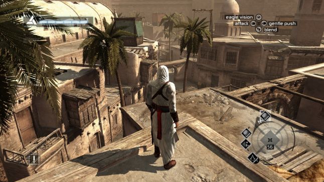
With Half-Life, this died off. It was compact to put your own style to a map and also appeal to the theme of the game (‘realism’). Instead, it was drawn towards how you achieved small things, like realizing doors, rooms, staircases, handrails and so on. At the same time, level design became a team power where before, an entire game could (feasibly) have been mapped out by a single person. This has continued just about all games since – maps now expose the character of the game rather than the designer (which is really how it should be).
Of course, some games aren’t like this. Games which attribute large illusion elements and design (think Unreal, Quake rather than Half-Life or Splinter Cell) are marvelous for putting your own style through, simply because you can create something so different to the rest of the game, and it will still seem at home. Those games almost expect the maps to be unique and varied. Other games expect the maps to be realistic and impressive.
